EchoPulse
UI design for a music-industry SaaS. Clear visual hierarchy and conversion-focused layout built to turn curious artists into sign-ups.
Project Info
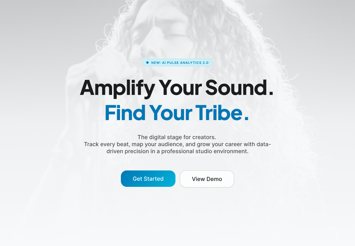
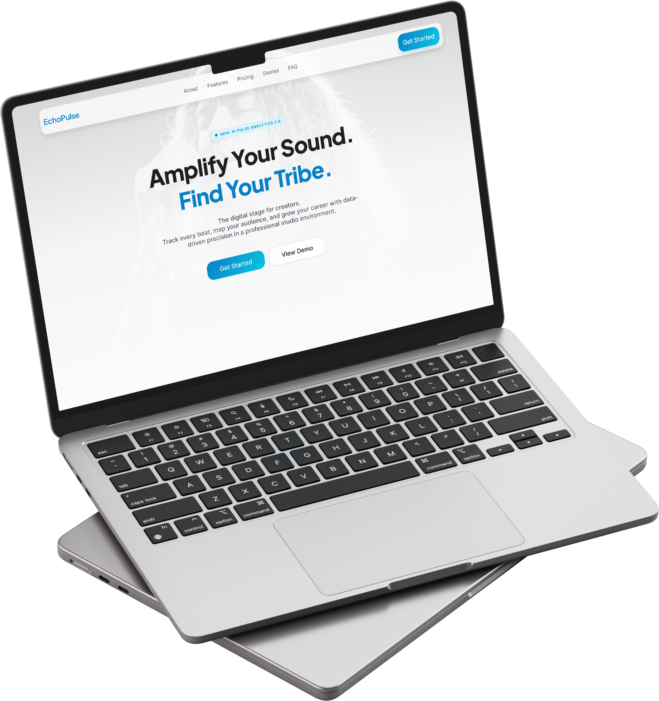
Getting artists to stop scrolling in three seconds.
Independent musicians are deeply skeptical of yet another SaaS tool. They've seen platforms that promise to simplify their career and deliver corporate dashboards instead. A site like this needs to earn attention instantly, before the visitor gets that familiar déjà vu.
The design goal was conversion without compromise: communicate what the product does, why it's different, and who it's for, all without the polished gloss that alienates the indie music world. The site needed to feel like it was built by someone who actually listens to music.
Every section had to address a specific objection in order: "What is this?", "Who is this for?", "Will this actually help me?", "Is it worth signing up?"
Speak artist. Convert artist.
Photography dialed back on purpose
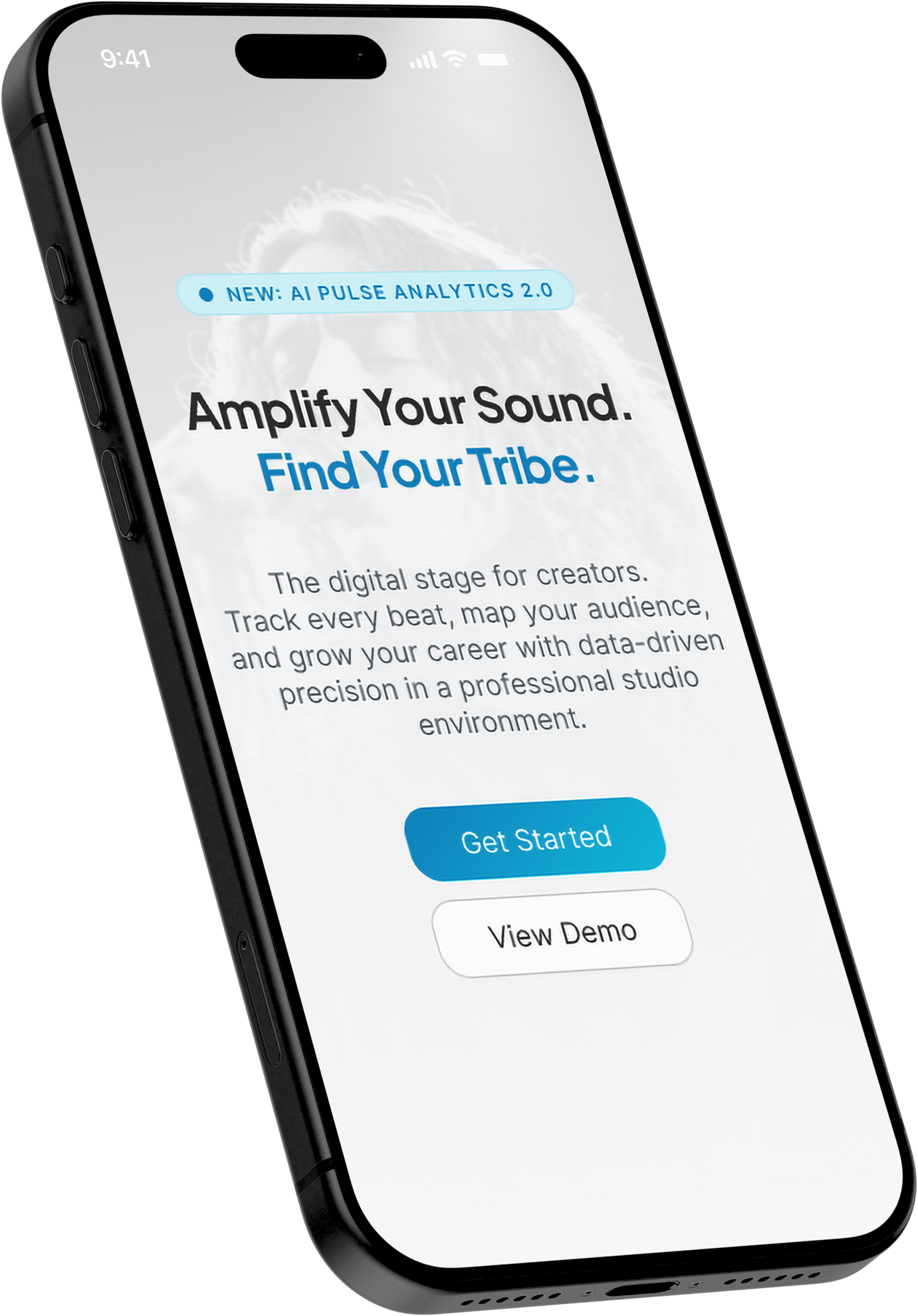
The hero uses photography at near-invisible opacity, enough to set a mood without pulling focus from the headline. Full-bleed, unfiltered photography arrives only in the section below, once the value proposition has already landed.
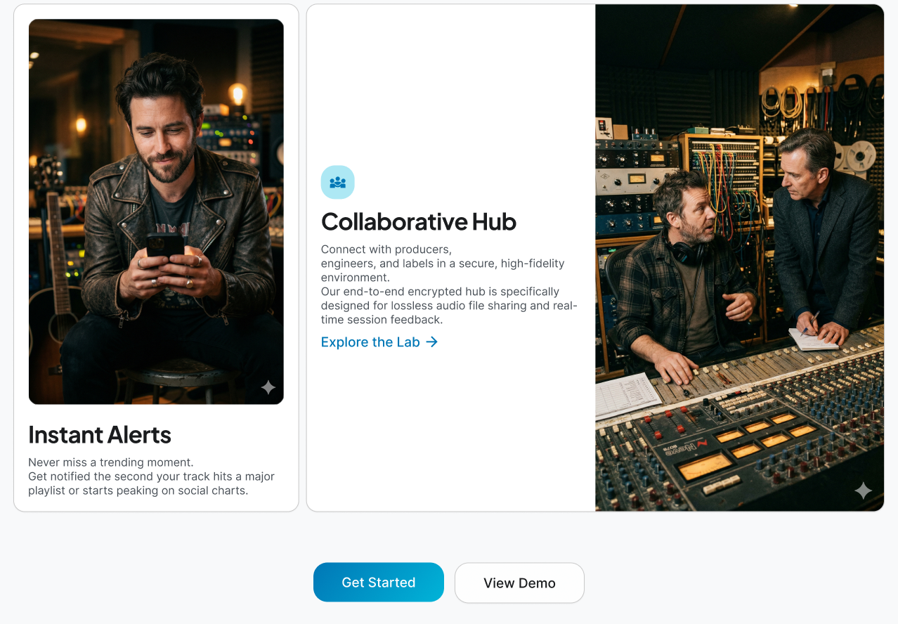
Features given a visual habitat
The features grid pairs each capability (analytics, mapping, collaboration) with photography from the artist world: studios, mixing desks, live spaces. This isn't decoration; it signals "built for people like you" before the visitor reads a single feature name.
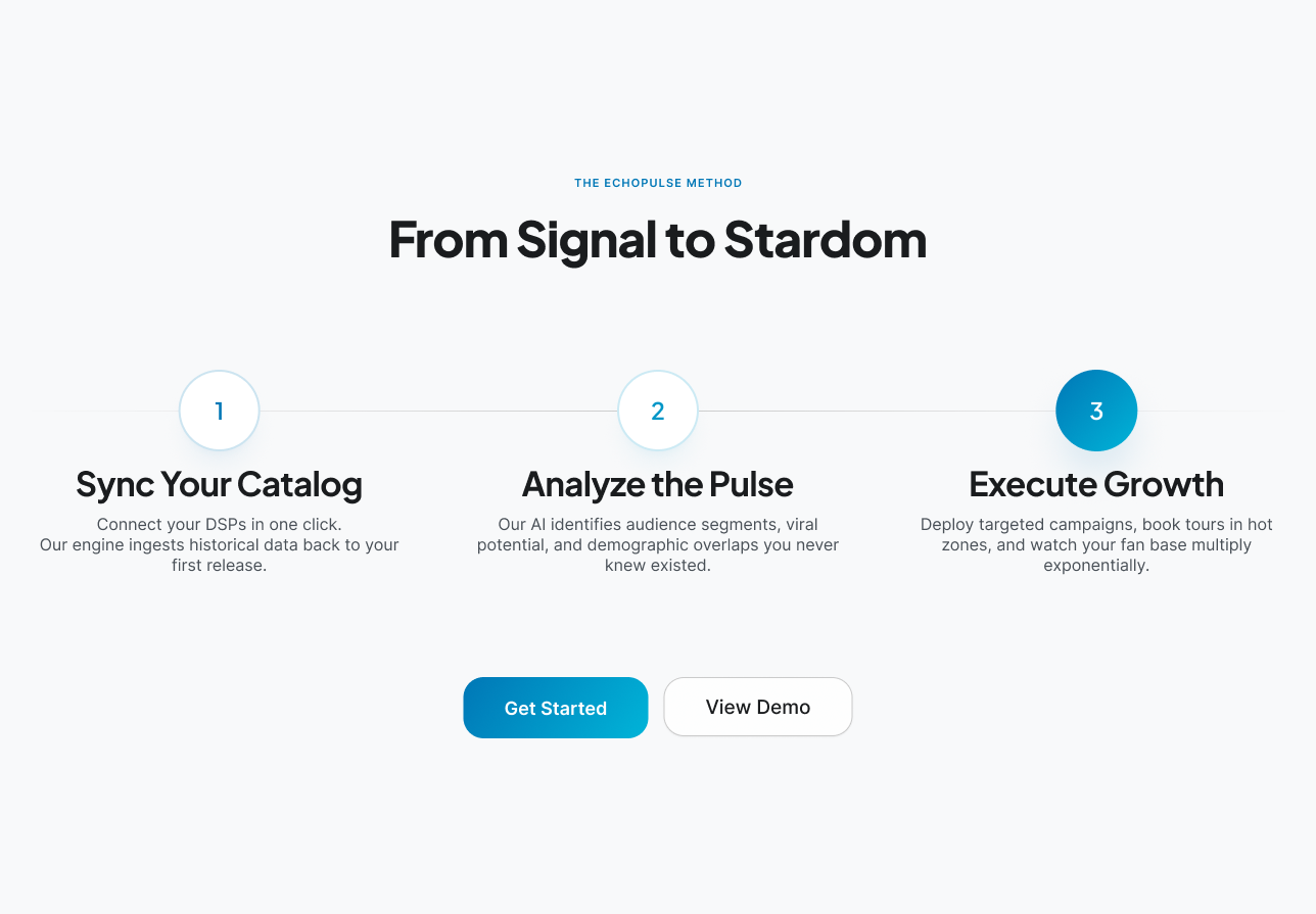
The product journey as a career arc
The "From Signal to Stardom" section reframes a feature walkthrough as a three-act progression: Sync Your Catalog → Analyze the Pulse → Execute Growth. Numbered, directional, and named after outcomes rather than actions, so the product reads as a career partner, not a utility.
A site that speaks artist, not enterprise.
The design communicates EchoPulse's value proposition in the language of its audience: direct, confident, and free of corporate noise. Every section moves the visitor one step closer to signing up.
Like what you see?
I'm open for freelance work and collaborations. Let's build something together.