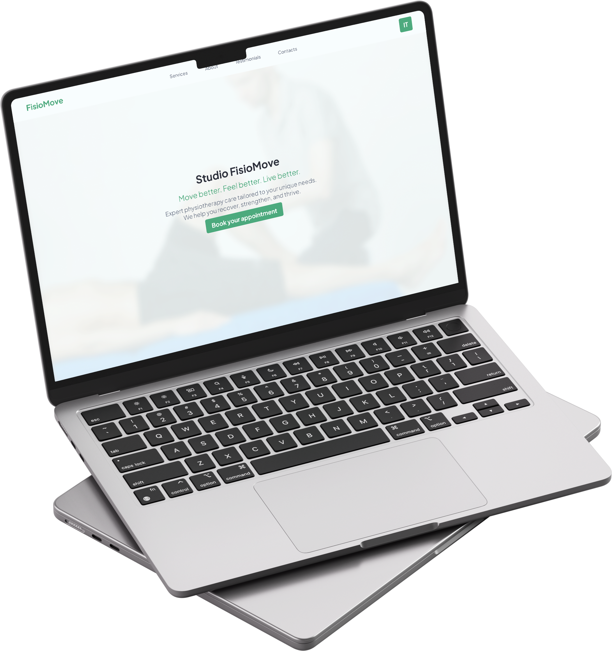
Studio FisioMove
Website design for a physiotherapy studio. A clean, reassuring layout aimed at earning the trust of new patients.
Project Info
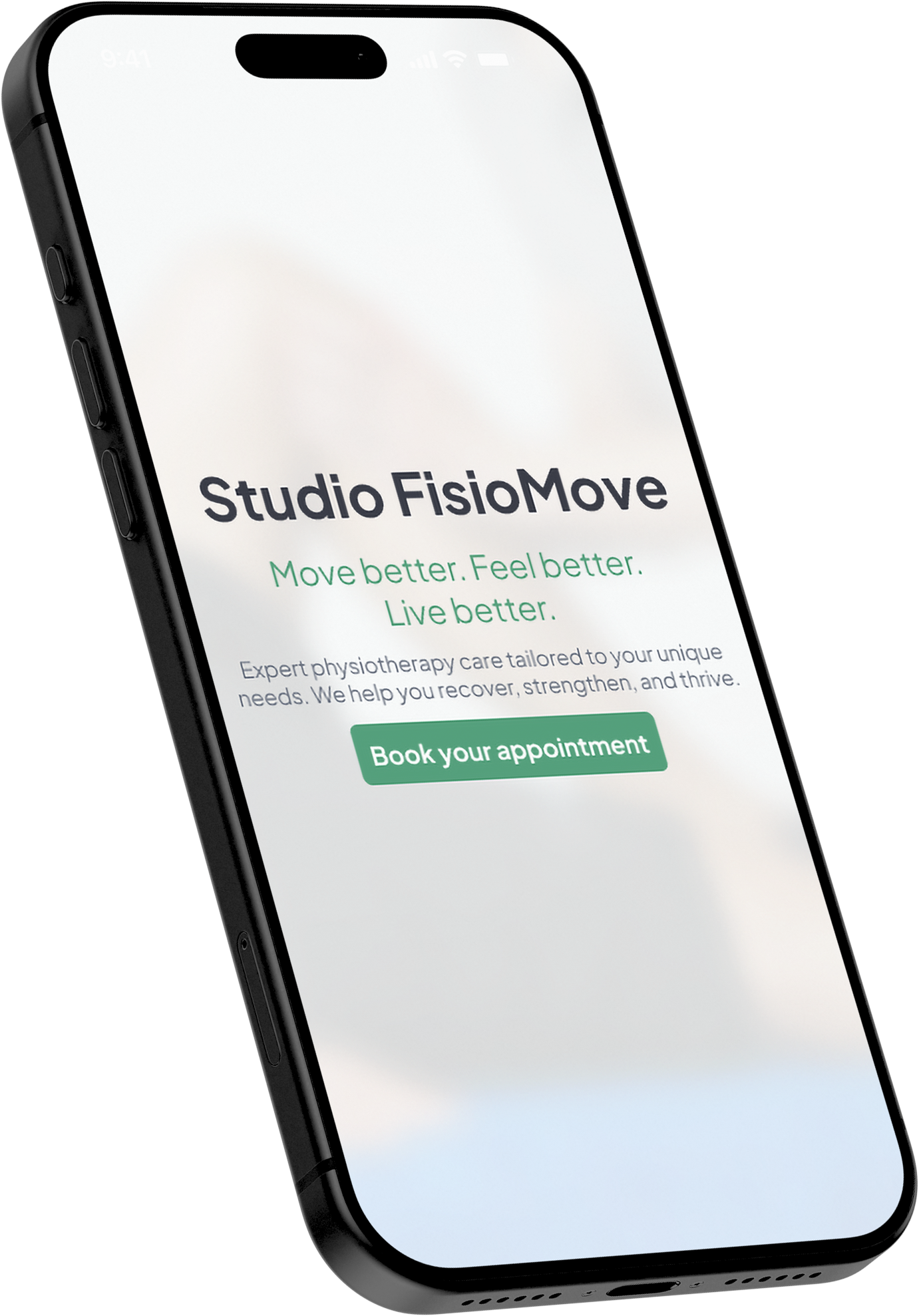
Designing for trust before the booking.
Most physiotherapy studio websites feel clinical in the wrong way: cold, hard to navigate, with no sense of who the team is or what makes the studio worth trusting. Booking forms are often buried deep.
For someone approaching physiotherapy for the first time, the primary question isn't "how do I book" but "am I in the right hands?" A site that fails to answer that loses visitors on the first scroll.
The design had one overriding goal: make new patients feel safe before asking them to commit. Trust comes first. Booking comes second.
Show the treatment. Earn the booking.
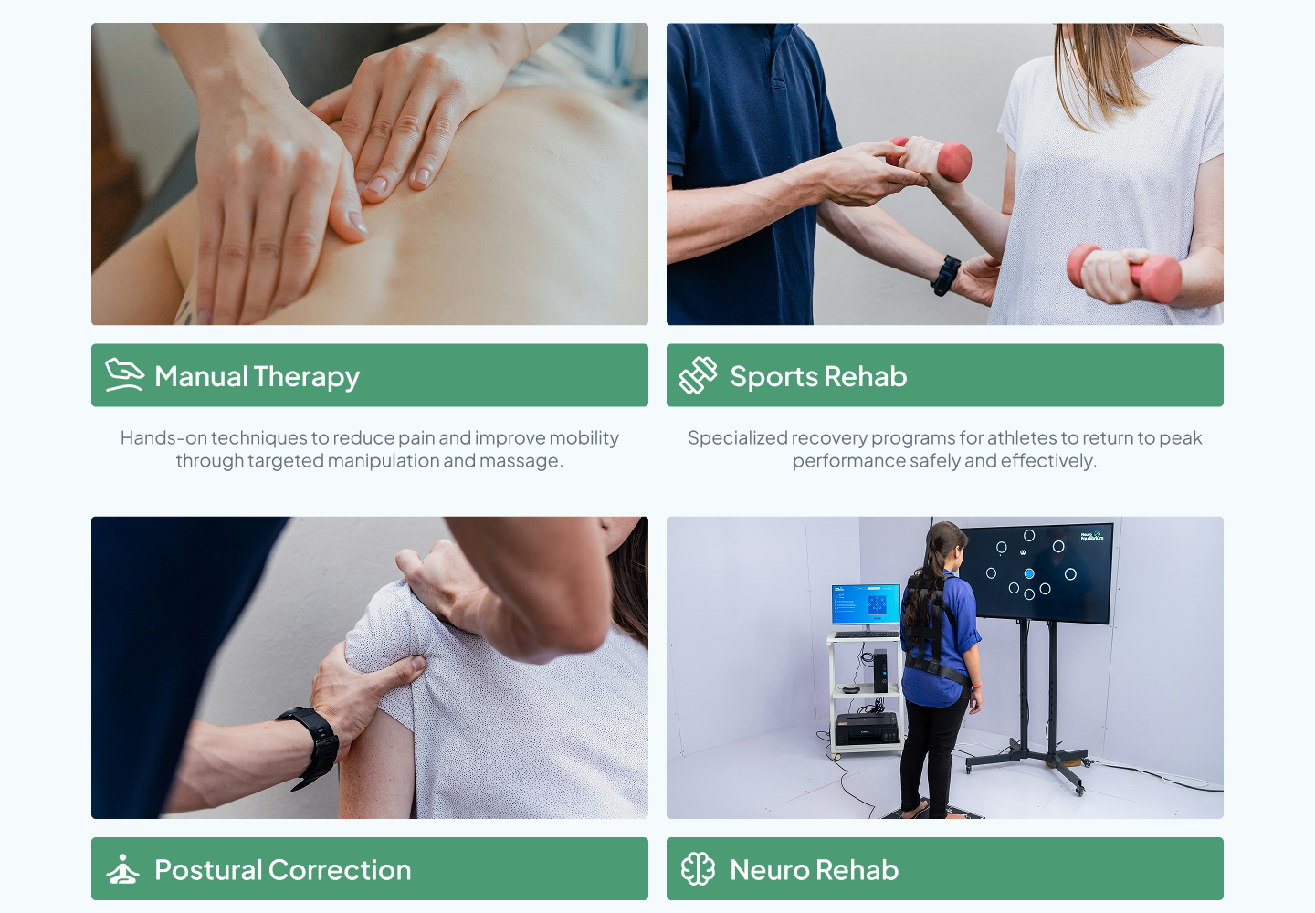
Services shown, not listed
Each of the six services is anchored by a photo of the actual treatment being performed. Patients see exactly what they're booking before committing, removing the hesitation that a text-only list would leave.
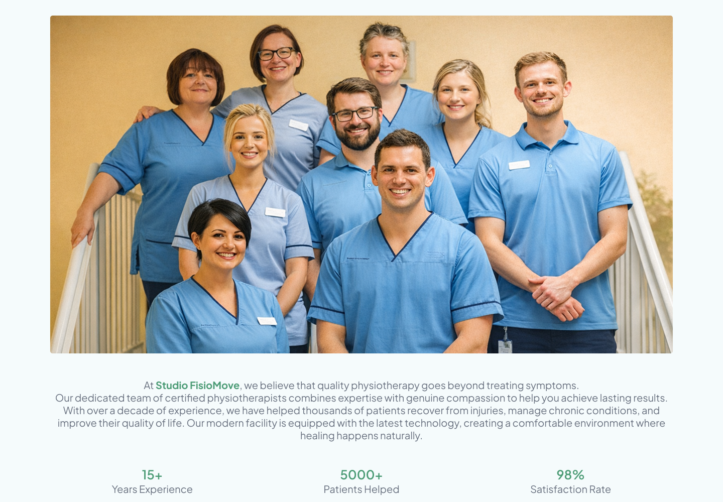
Proof stacked before the ask
The page sequences trust deliberately: team introduction, then hard numbers (15+ years, 5000+ patients, 98% satisfaction), then patient testimonials. Only then does the booking CTA appear. The visitor has nothing left to doubt.
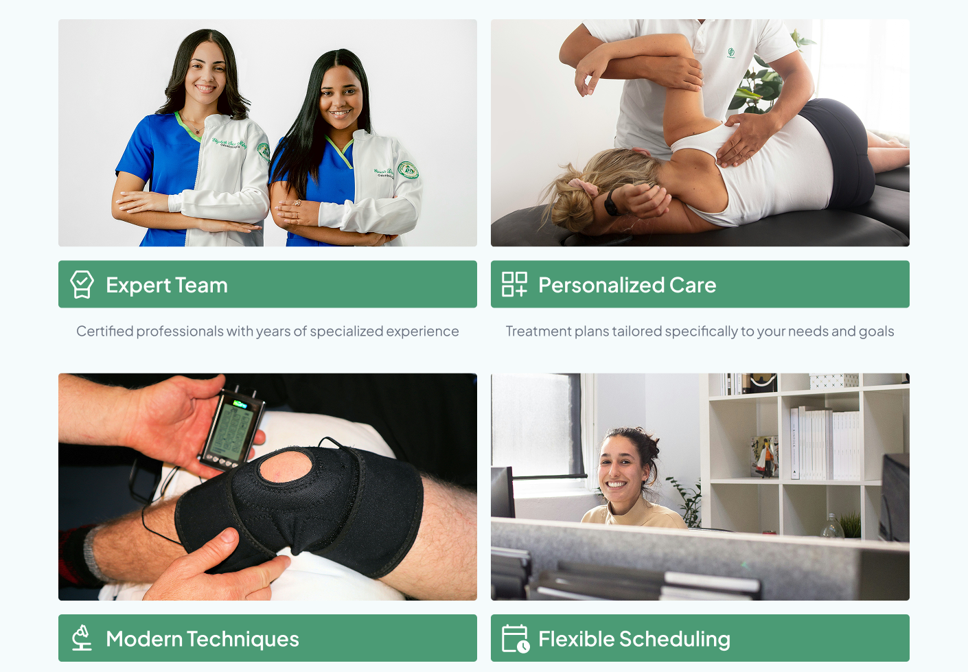
The team as the brand
Real staff photos appear in the services grid, the "Why Choose Us" section, and the About photo. The practice feels human before it feels clinical. The people are the product, and the design makes that impossible to miss.
Recovery starts with the right first impression.
The site leads with credibility and closes with convenience, reducing the friction between finding the studio and booking a first session.
Like what you see?
I'm open for freelance work and collaborations. Let's build something together.